Crafty Counter
Persona-Based Ecommerce Website Redesign
- Date: June 2020
- Project: Website Redesign and A/B Test
- Company: Geek Powered Studios
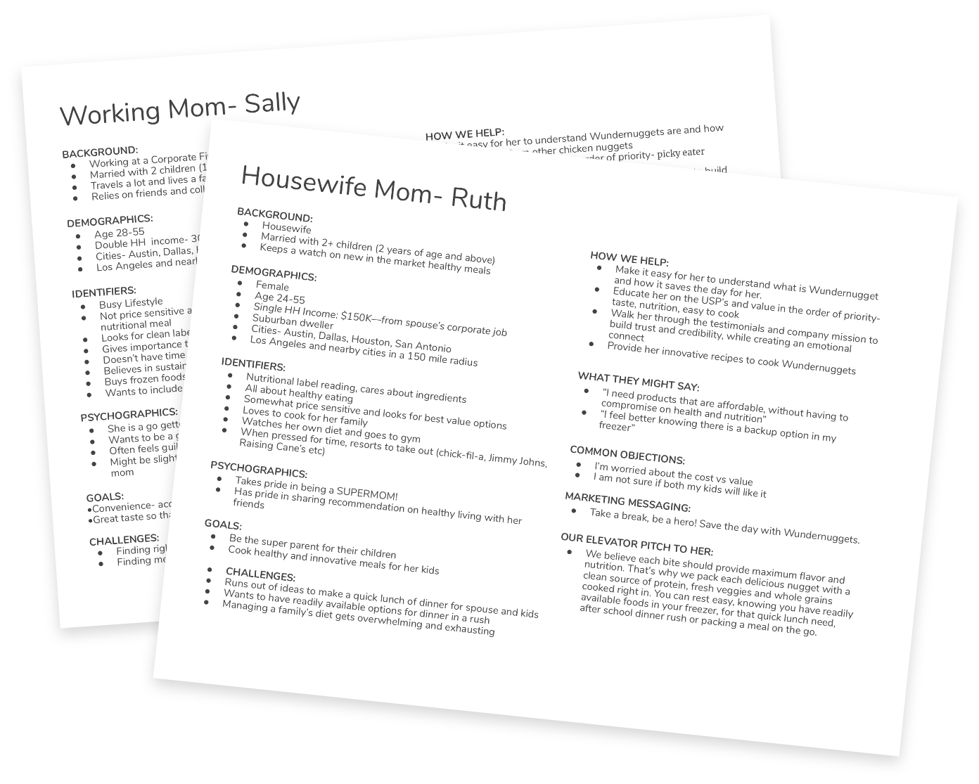
Target Personas
Moms & Kids
In order to keep the website focused on its users, we established several personas with the help of the client. The primary two personas were both mothers looking to have easy, healthy meals for their family.
Working Mom (Sally). Wundernugget's primary persona is a working mother with a family at home. Messaging for this user focused primarly on the ease to cook the product, as well as being "picky-eater approved" and tasty for the kids.
Housewife Mom (Ruth). Selling points for the housewife persona Ruth also focused on the taste for kids, but put a heavier focus on the health benefits and ingredients of the nuggets.
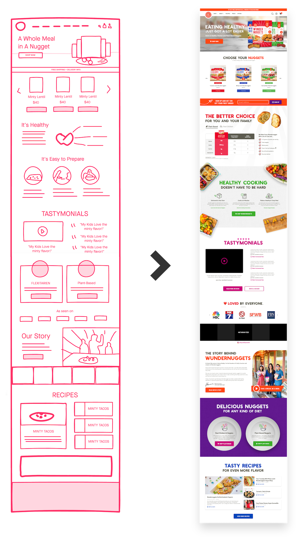
Wireframe & Mockup
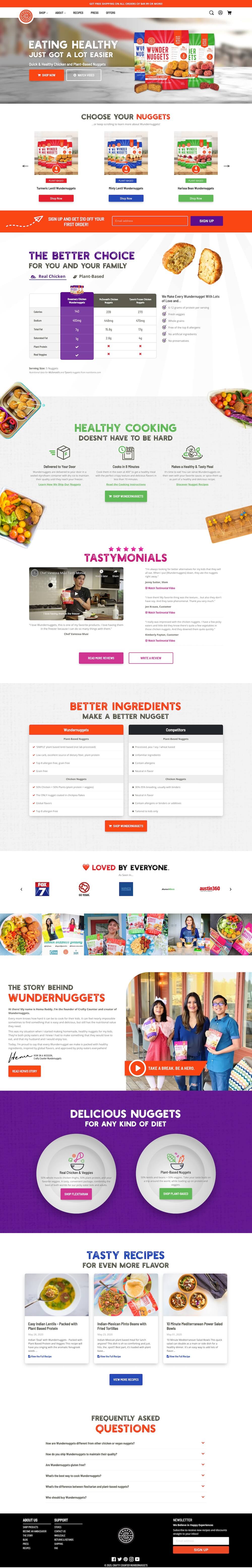
Website Conversion Structure
- Product Hero. The hero section focused on introducing users to the product. We decided to include a photo of the packaging and a plate with images of the nuggets. The text was intended to highlight the primary benefit of the product.
- Product Carousel. To accomodate spontaneous users, the next section immediately featured a carousel of the products to help users access their preferred flavors.
- Features/Benefits. Since most users were learning about the product for the first time, it was important to differentiate Wundernuggets from the competition. This began as a simple list of benefits, but developed into a nutrition facts comparison chart with competitors.
- UVP: Convenience. One of the key benefits of Wundernuggets over other family meal options is the ease and convenience to make a healthy meal, so we highlighted this benefit in its own section.
- Trust Builders. Next, it was important to begin building trust with the customers through social proof. Having filmed several customers that have enjoyed Wundernuggets, we included testimonial videos and reviews, followed by press logos and an instagram feed.
- Founder's Story. The founder's story of creating Wundernuggets to make meal-prep easier for her family was a powerful message that reflected the customers' same pain points.
- Segmentation. At this point on the page, our goal was to encourage users to segment themselves towards the products that were most relevant to them.
- Recipes. For users that reached this section, we wanted to begin providing value and show that the Crafty Counter brand cares about its customers. This recipe section featured the most popular recipes that have been created with the product.
- Frequently Asked Questions. This final section before the footer helped to answer any other concerns that users might have.
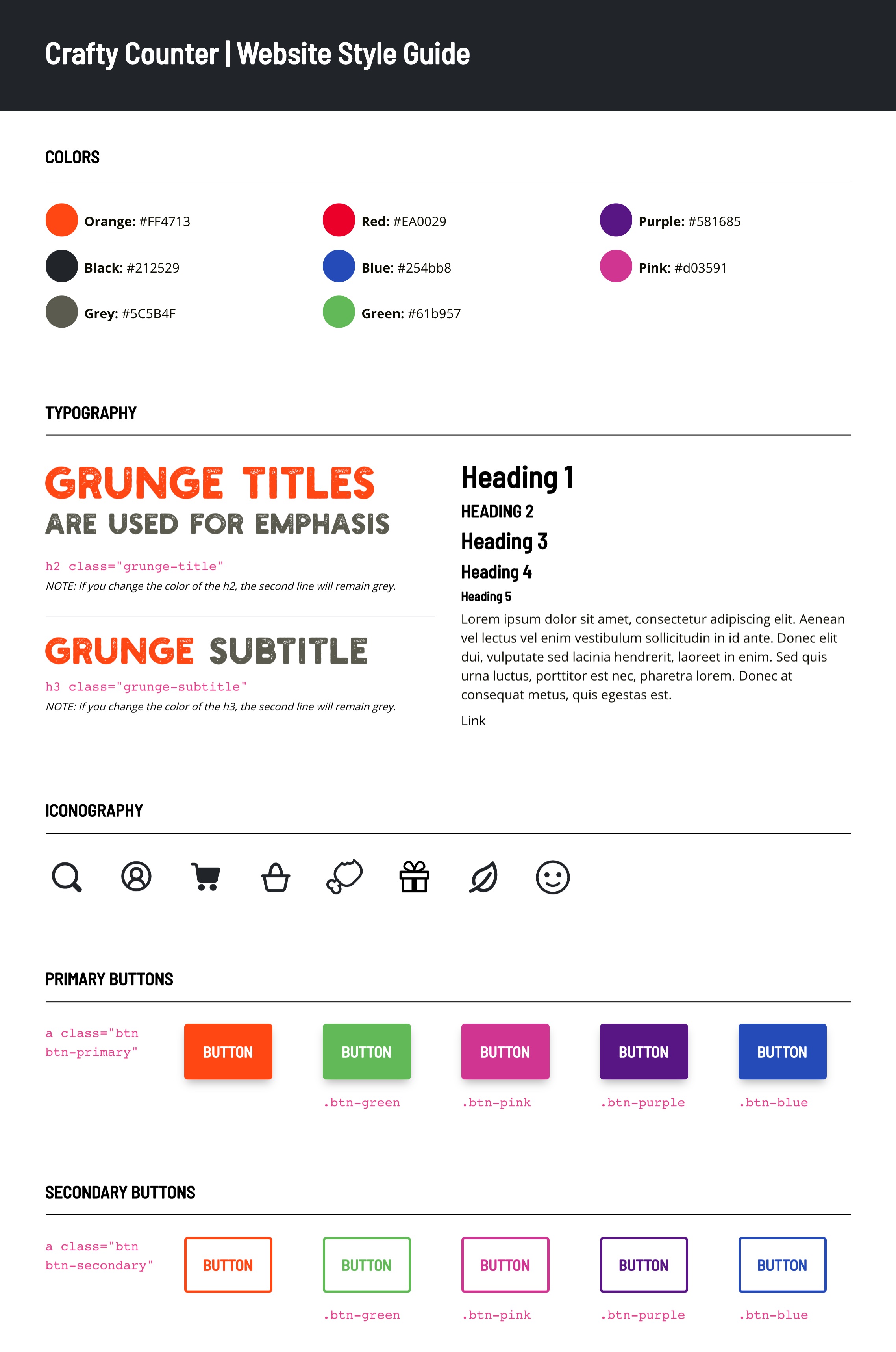
Visual Design
New Style Guide
With the new homepage, we decided to incorporate new visual design standards on the website.
Color. I expanded their palette from a basic orange and black to a wide range of colors to give it a more colorful, child-friendly palette.
Fonts. I selected the Holtzberg font with a grunge texture to convey the natural, healthy ingredients and Barlow Semi Condensed as a condensed, rounded subtitle font for a childlike appeal.
Iconography. To better match the mindset of moms cooking for their kids, we selected a new, bold iconography style with rounded edges.
Buttons. Global CSS classes were set for each style of button and color for easy use across the entire website.
A/B Test
Hero Title Shows a +343% Conversion Rate
After the new homepage design launched, I used Google Optimize to initiate an A/B with the content on the homepage. Of the three variants, one showed a clearly higher conversion rate with 90% confidence that it was the winner.
- Variants
- Conv. Rate
- Confidence
- Eating Healthy Just Got a Lot Easier
- 0.0%
- 6%
- Tasty Nuggets Made with Real Veggies
- 1.73%
- 90%
- Healthy Nuggets for the Whole Family
- 0.39%
- 4%
This is just for me... I really like this article: The Power Law of CRO 🙌