Client: Stan’s Air Conditioning & Heating
Company: Geek Powered Studios
Date: March 2019
TL;DR
By designing a new multi-step form, I was able to increase the conversion rate of form submissions by 5.51% on the website of an AC repair client. By utilizing a number of UX and persuasion principles in the design, I reduced the users’ cognitive load and streamlined the conversion path. During the process, I prototyped a new design, presented it to the client, developed the new form in WordPress, and executed an A/B test.
The Challenge
Geek Powered Studios was looking to focus more time and effort on improving the conversion rates of their clients. One of these clients was an AC and heater repair company in Austin, TX.
While analyzing the client’s website design, I noticed that their main form on the home and contact pages had some key UX concerns that could be discouraging users from filling it out.
Some of our concerns included:
- The lack of a call-to-action title
- 8 form fields being displayed simultaneously
- The fields being displayed inline as opposed to vertically
I set about to design a new form that would reduce these friction points and encourage users to convert.
The Solution
I started by outlining the scope and goals of the project.
The goal was to increase the conversion rate of the scheduling form by utilizing persuasion principles without sacrificing any of the information that was gathered from the customer in the process.
I then designed an initial prototype of a new, multi-step form that led users through the process of scheduling their service using Adobe XD. Creating a prototype for the initial design allowed us to have a fully-functional design for review and approval by the client without spending the excess time and resources required for actual development first.
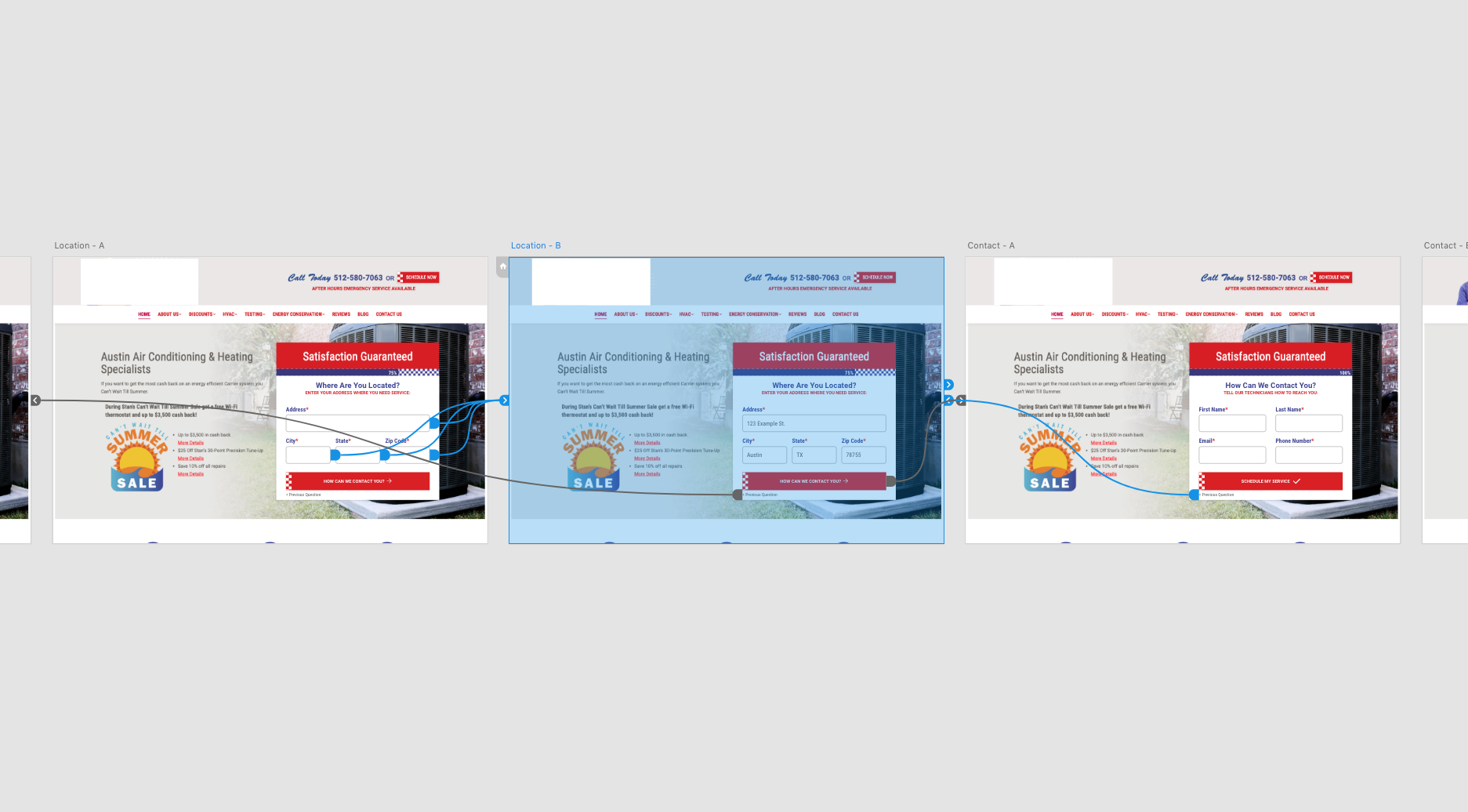
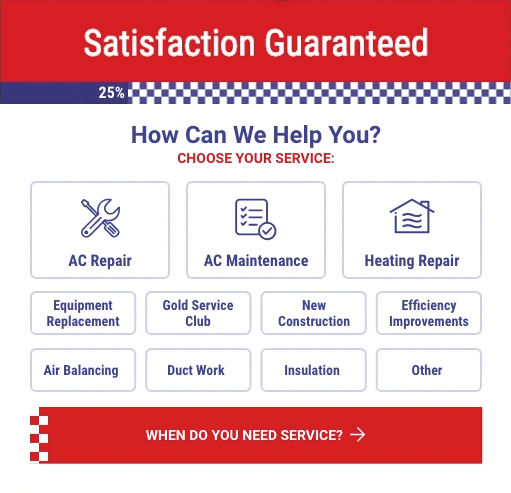
The form included 4 steps:
- Choose Your Service
- Select Your Date and Time
- Enter Your Address
- Contact Information

Along the way, the user would be encouraged to continue to the next step of the process through a number of persuasion principles. The most prominent of these was the use of Hick’s Law, which states:
The time it takes to make a decision increases with the number and complexity of choices.
Our hypothesis was that reducing the user’s cognitive load by separating the form into different steps would reduce the friction points that might prevent them from completing the form.
These persuasion principles were implemented in the new design of the form, including:
- A progress bar showing that the form has more to be completed (humans don’t like to leave things incomplete)
- A single, specific question and call-to-action for each step (i.e. “How Can We Help You? Choose Your Service:”)
- Using low barrier-to-entry questions for the first step to get users started
- Button verbiage that make it clear what to expect on the next step
- Highlighting frequently picked inputs to reduce cognitive load
I presented the new form design to the client in person and explained the strategy and KPIs, and they approved it for development.
I built the form in a WordPress environment using the Gravity Forms plugin for most of the functionality. I then wrote all of the CSS styling to mimic the prototype and make the form more user friendly.
Once the development was complete the form was added to the website and I created an A/B test using the Google Optimize tool to only show the new form design to 50% of the website visitors.
The Result
After two weeks of testing, the multi-step form showed a 5.51% higher conversion rate than the original form, increasing from 7.62% to 13.13%.

The A/B test was actively running for 14 days from May 8, 2019 to May 20, 2019. In that time, it collected a sample size of 854 sessions split between the control group (version A) and the variant group with the multi-step form (version B). By the end, the test reached a statistically significant result with 95% confidence.


This was a really fun project for me to take on. It was completely self-initiated within my first 2 week at this company. In addition to seeing the phenomenal results once the project was finished, it also won me an Amazon gift card as part of an internal design competition.
Now that I’ve seen the results, my goal moving forward will be to start recommending similar techniques based off the same design principles. For example, I’d like to create a new page specifically for this form and strip every distraction possible away including the navigation, footer, external links, etc. Anything that we can take out. We could run this as a second A/B test to build on the learnings from the first one.